Dinosaur Alphabet by Barbara Dziadosz

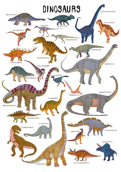
Together with the bilingual magazine Papperlapapp I created a dinosaur alphabet. This was a fun and challenging project with a bit different twist then usual.

I was given a A-Z list of the dinosaurs and once again let a lot creative freedom to create those illustrations. Together with the client I agreed on a different approach to this projects. We came along that sketches were unnecessary and the images would be less planned. 

For each one of the dinosaurs I created lots of hand drawn patterns and structures that I included. I used a limited color palette of 4, even though I used different opacities to have some more range. 

AllDinosLOW.jpg
Bagaceratops.jpg
Mamenchisaurus.jpg
Struthiosaurus.jpg

Sonntagszeitung Pensionskassen Rating 2018 by Barbara Dziadosz

I did a bunch of illustrations for the Swiss Sonntagszeitung special issue to accompany the new retirement ranking in 2018.

The assignment was rather short termed but I was given lots of creative freedom during this. 

While doing my research for this special topic I found always the some old visuals, that I found rather boring and less surprising. So I tried to come up with some flowerful elements, to show the growing possibilities of the future pensioners. But of course I had to come up with the classic piggy, but this comes just from my love for those pink animals-such a perfect excuse to incorporate them into this series.

coverPark.jpg
Segler.jpg
geldturm.jpg
kapitalanlage.jpg
velo.jpg
coin.jpg
rechnung.jpg
mysteryShopping.jpg

I always try to come up with 2-3 sketches for each illustration, so naturally there are lots of unused sketches that I still would like to share with you.

hände.jpg
krankenkasse.jpg
sanduhr.jpg
schweinVShummer.jpg
spielen.jpg

Trzy Czte Ry by Barbara Dziadosz

The two ladies from @trzy_czte_ry  asked me if I was interested to contribute to their new quarterly kids mag. The issue was about tricks, so I illustrated two cut out jumping jacks. For the background.I illustrated a playful pattern with some typical elements like my beloved grid.

This issue features a lot of my favorite polish illustrators, which made it even more fun to contribute.

trzycztery.jpg
trzyczteryPattern.jpg
35049200_846081945575705_5527566955118067712_n.jpg
33224547_836977753152791_2483283003158036480_n.jpg

Wrap by Barbara Dziadosz

I just recently received the beautiful tissues from no issue. So from now on my Fine Art Print are going to be wrapped in these beauties.

For the design of the tissues I made a fun composition of all different illustrations, a so to say best of. First I thought about a simple pattern, but then I wanted to do a more variable pattern, which turned out to be a great idea.

The tissues are of a perfect quality and add such a exclusive touch to my orders as well look lovely a a gift wrap.

IMG_9778.jpg
IMG_9780.JPG
IMG_9784.JPG

Brummell mag by Barbara Dziadosz

The fine folks from Brummell mag asked me to illustrate a page a about gin and bees, how could I resist this fine assignment!?

The client referred to one of my "hands with flower" illustrations, which was a lovely idea for this feature. I immediately had a picture of a possible illustration in my mind. 

Below is the final illustration with a little bee on the side.

GINDEEP.jpg
GIN.jpg
GINBee.jpg

Followed by early stage sketches for this feature.

The main focus should be on the Gin itself and it`s ingredients, that`s why I chose to show the lovely bottle surrounded by lots of flowers and herbs.

GinBottle.jpg

My second idea was to show a lady enjoying a glas of Gin. The text referred to the owner, a clever woman who`s family also own a crisps manufacture (such a dream!), so I imagined her when drawing this. 

GinGirl.jpg

As I really enjoy drawing hands I finally drew this version of an elegant hand holding a full glas of Gin surrounded once again by all the beautiful ingredients. 

GinGlas.jpg

Google doodle by Barbara Dziadosz

I had the great honour to create a google doodle to celebrate the kick off of the strawberry season in Germany.

The whole point of this assignment was to celebrate the best season of the year: the strawberry season! The briefing let me lots of creative space to play around and to try out different ideas. 

I focussed on the simple beauty of the fruits and added some summery characters whom interact through the scenery. It was a lot of fun to incorporate one of the most know Logos of the world into my illustration and still stay loose and fun.


1.jpg

Here are some early stage sketches following some different ideas. In the end we did a mix of two sketches, using the google colors and letter replacements to reflect the logo.

unnamed-1.jpg
unnamed-2.jpg
unnamed.jpg
strawberriesBW.jpeg
unnamed-3.jpg